
Improving doctor-patient communication for seniors
Empowering patients to plan, prepare, and organize medical conversations
Duration
6 months
Disciplines
- UX Research
- Product Design
- Accessibility-focused UX (WCAG)
- Project management
Tools
- Figma
- Miro
- Zoom
- Microsoft Office
TL;DR
Bedside Chats is a health tech startup sponsored by ACGME and OSU that helps senior patients (70+) prepare for doctor visits and improve communication with their providers.
Problem
Before launch, the team needed to validate whether Bedside Chats had a viable market space. This would give the design team clear direction for product and design decisions.
My Role
UX Research, Product Design, Accessibility-focused UX, co-design workshops, prototype testing, and project management.
Outcome
Validated the product before market launch. Delivered an intuitive, accessible app, fixing confusing terminology, simplifying navigation, and adding family-sharing for caregivers.
Team
Partnered with physician Andrew Nashed (creator), Luiza Correa and Aline Marangoni (Product Designers).
Impact
Seniors found the app easier to navigate, with clearer hierarchy, larger touch targets, and familiar chat-style interactions, solving the accessibility gaps research uncovered.
Timeline
6 months, 2 phases: validation and design research, then iOS accessibility-focused design.
So What?
Validating Bedside Chats and designing its iOS version in 6 months proved that research is a strategic safeguard, not just a usability check. Pew data confirmed real market demand, while interviews revealed the true barrier was usability, not desirability or usefulness. Using Agile and Lightning Decision Jams, the team turned that insight into a redesigned app with simpler navigation and caregiver support, proving research-first design prevents wasted development in the growing senior digital health market.
Constraints
Target OS (iOS 11) legacy requirements, high system complexity, and fixed branding elements (colors/elements) defined by the Co-founder.
Process
The Challenge:
Validating a healthcare app before it reaches seniors
Bedside Chats had a promising concept: helping seniors organize questions, notes, and medical information for their visits, but it had never been tested with its core audience. The challenge was uncovering whether seniors (70+) with varying digital literacy, motor control, and cognitive load could actually use it.
The core question
“Does Bedside Chats solve a real problem for seniors and their providers, and can seniors navigate it well enough to make that value real?”
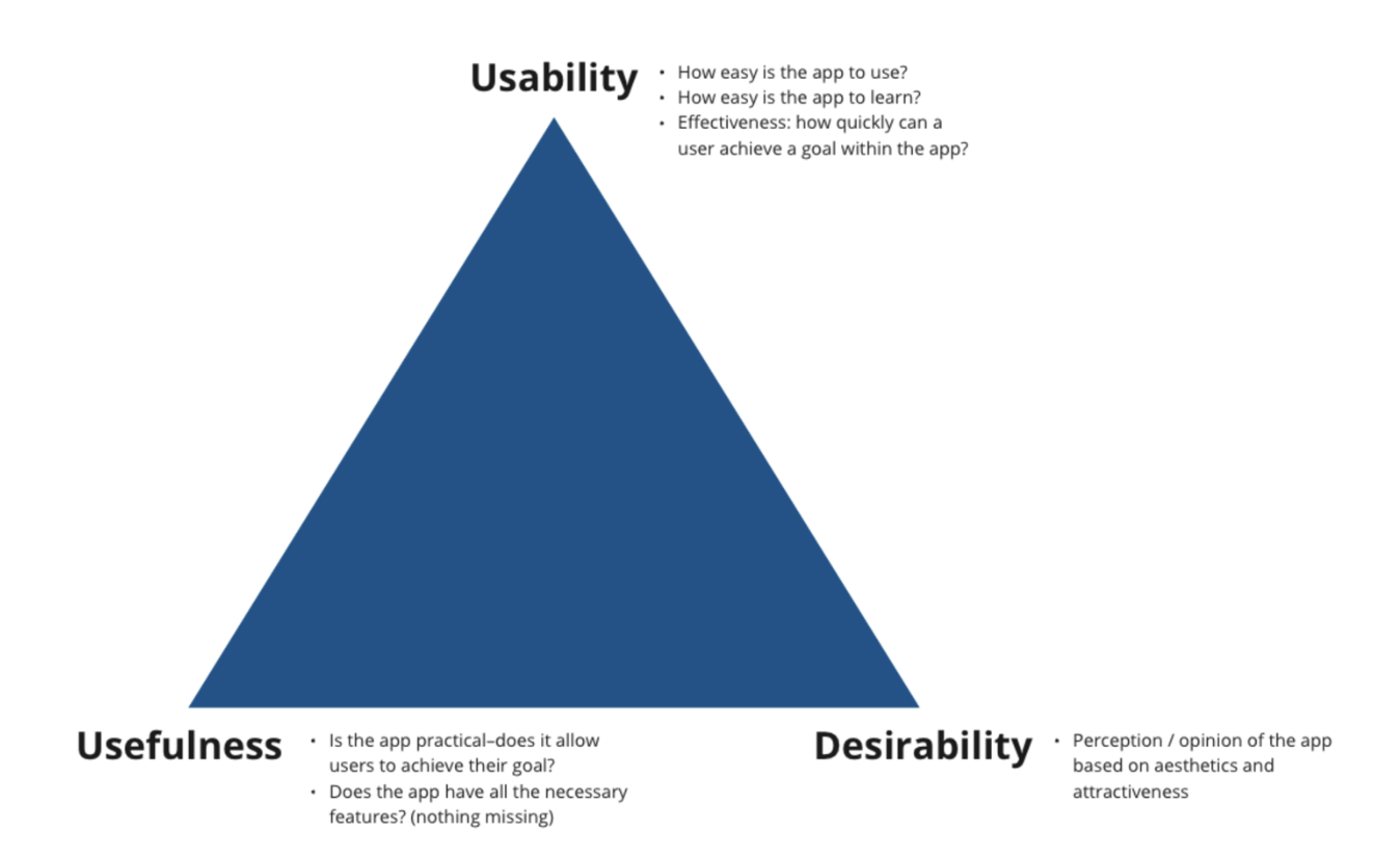
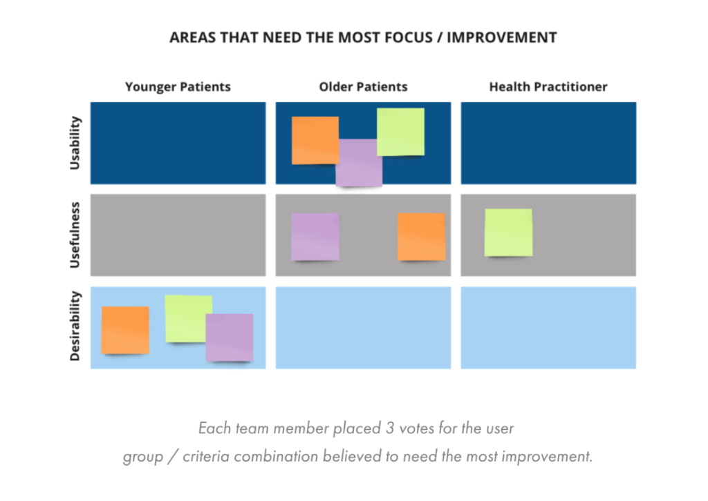
MAPPING ASSUMPTIONS
The team mapped assumptions around desirability, usability, and usefulness to identify bias, align priorities, and validate with users later.
Phase 1: Research & Validation Phase
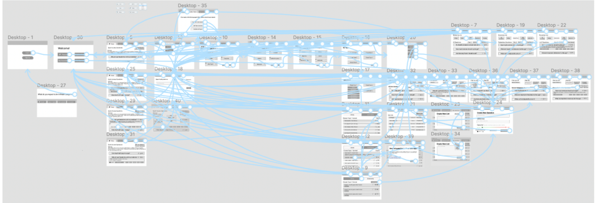
We designed screen flows, navigation structure, and core interactions to build a low-fi prototype for early testing and feedback.
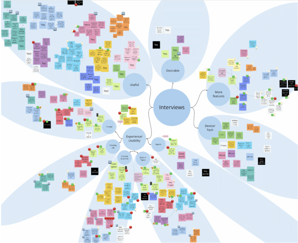
Then, we interviewed users (seniors + physicians) to identify usability barriers and gather feedback on navigation, terminology, and accessibility.
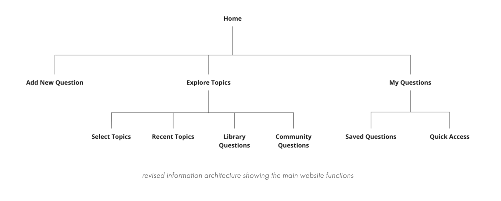
Information architecture tree
Functionality-focused mockup
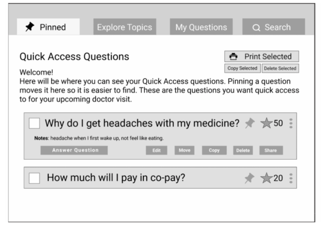
Ready-to-test prototype
Research synthesis snippet
Major Findings
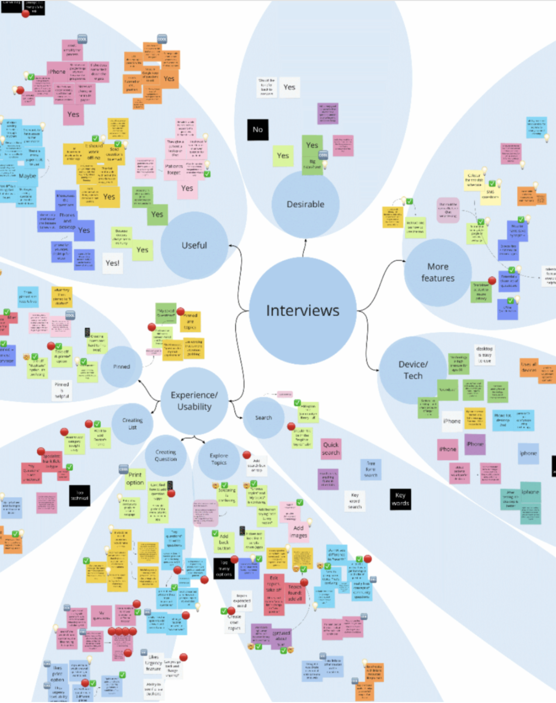
Terminology Issues
Users did not understand terms such as “Pinned”. Solution: renamed to “Quick Access”.
Navigation Struggles
Users had difficulty understanding hierarchy, locating actions, and navigating sections.
Solution: simplified navigation and information architecture.
Accessibility & Caregiver Needs
Users needed: clearer interactions, reduced cognitive load, and family support access. Solution: added family sharing/access functionality + device discussion.
Phase 2:
Research & Accessibility
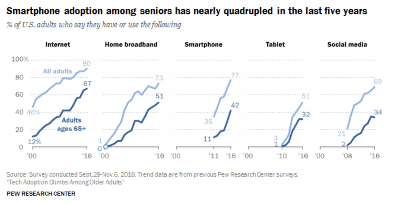
The senior demographic is increasingly digital, but underserved
40%
Of seniors expressed interest in tech for medication reminders and provider communication.
21%
Of seniors are open to video conferencing with providers.
4x
Increase in smartphone adoption among seniors in the last 5 years.
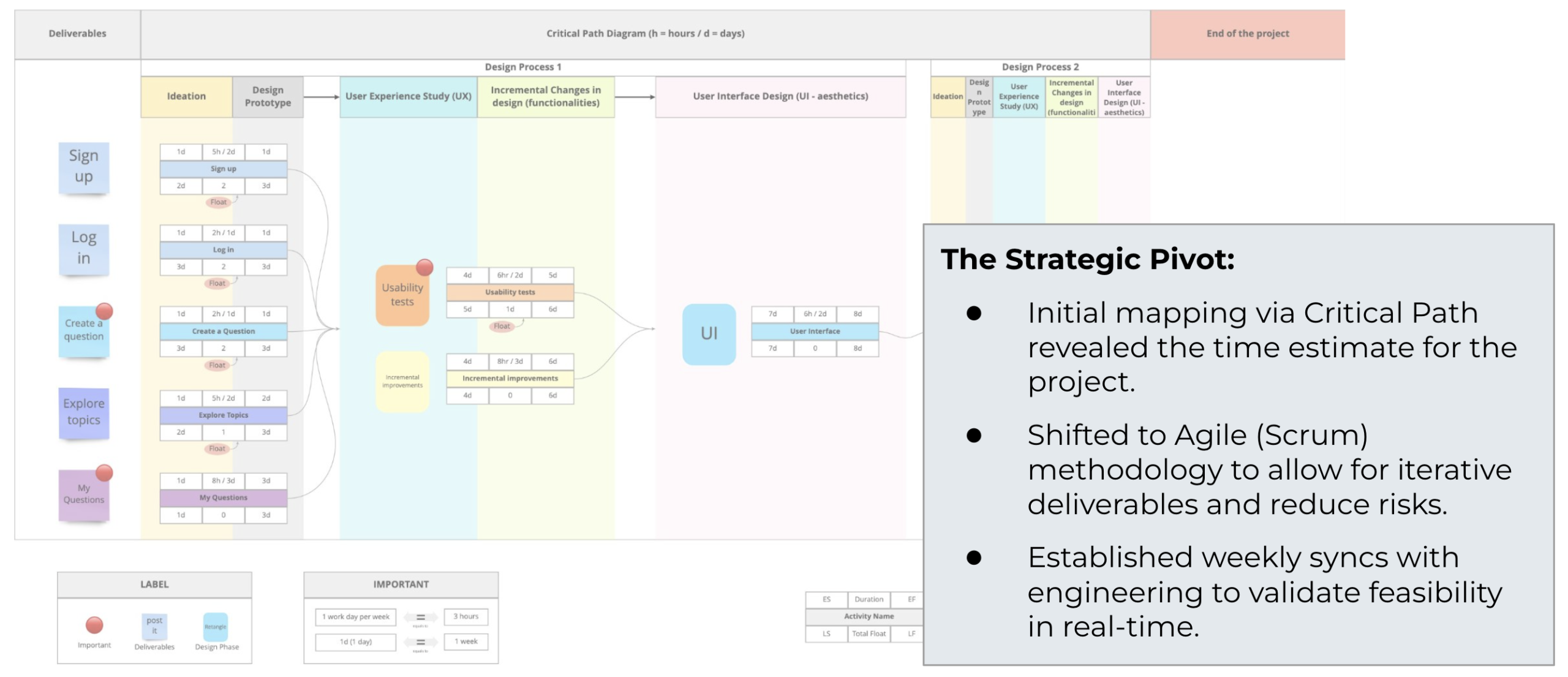
Adapting project management rigor to meet a 3-month deadline.

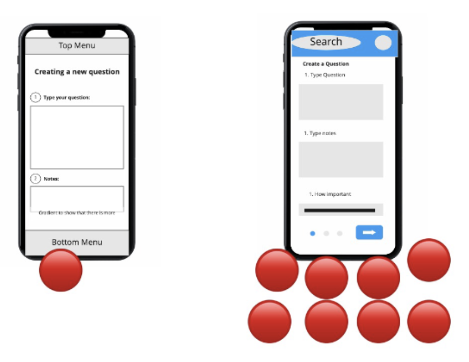
Generating mobile concepts from web constraints in 90 minutes.
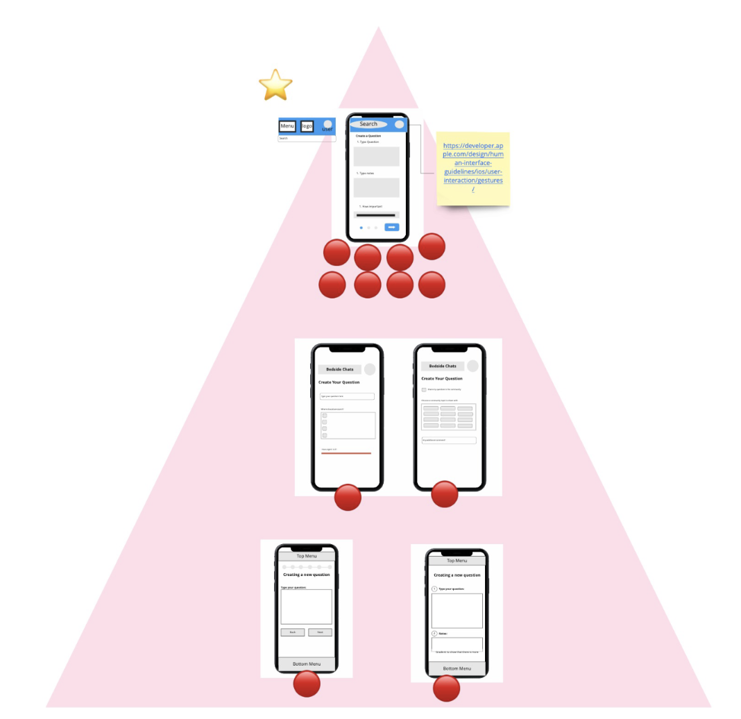
The team successfully adapted 4 out of 6 core pages in a single 1.5-hour session using the Lightning Decision Jam technique.
Step 1: Ideation
Generation: Silent sketching to prevent groupthink.

Step 2: Voting
Voting: Democratic selection of strongest features.
Step 3: Convergence
Prioritization: Selecting MVP features for the 3-month sprint.
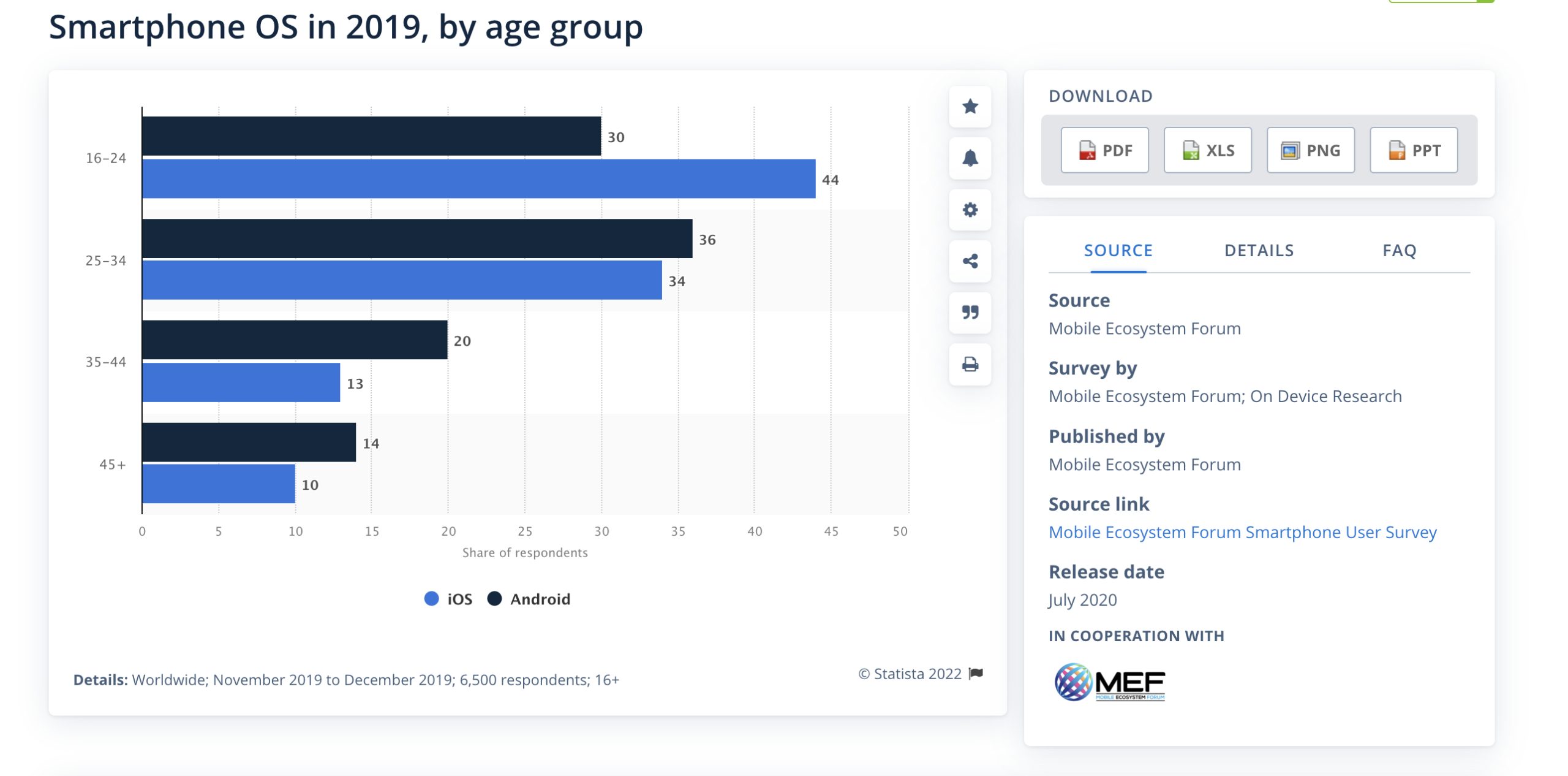
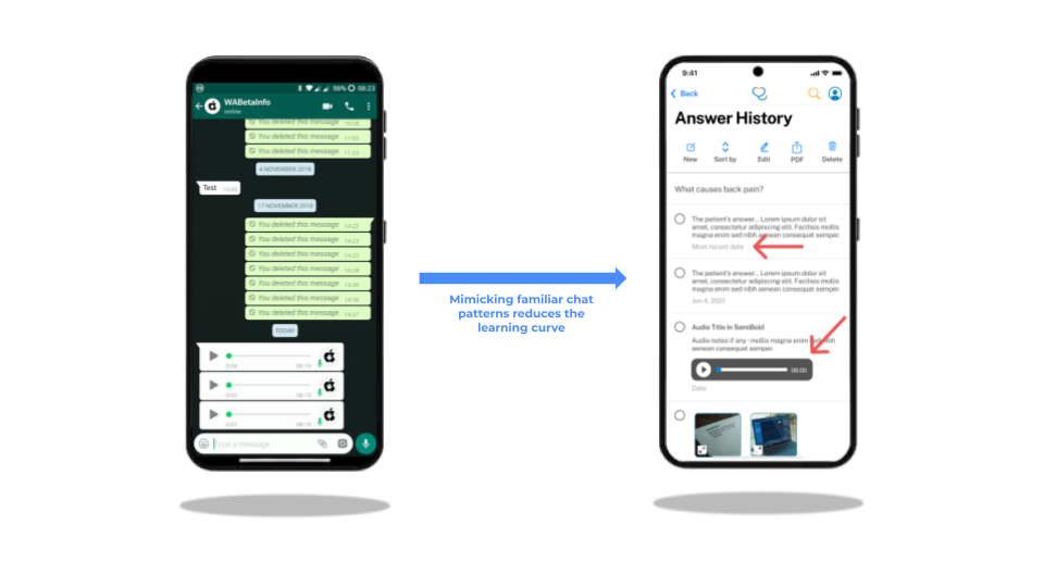
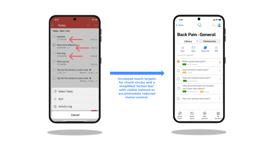
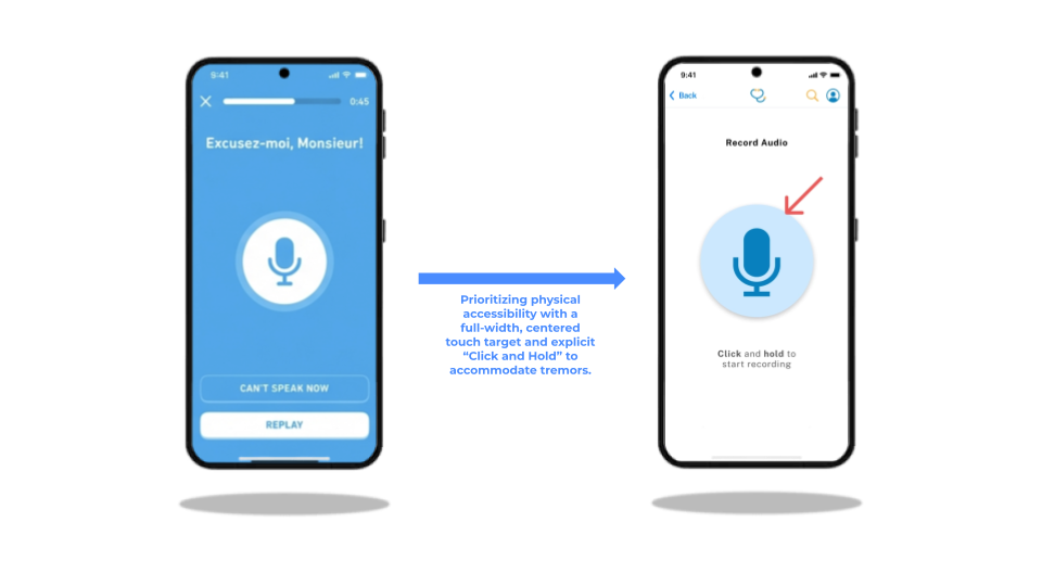
To minimize friction for elderly users, we avoided reinventing Ul patterns.
Instead, we conducted benchmarking research to leverage interactions seniors have already mastered in other popular applications. mobile concepts from web constraints in 90 minutes.

Analyzed for chat interface architecture, specifically evaluating linear message threading and the visual communication of deleted-item states.

Todoist
Audited for list management systems, with a focus on multi-select interaction patterns and nested checklist logic.

Duolingo
Evaluated for voice/audio UX, specifically the accessibility of high-affordance button targets and real-time recording feedback loops.
Chat History
List Selection
Audio Interface
The Constraint
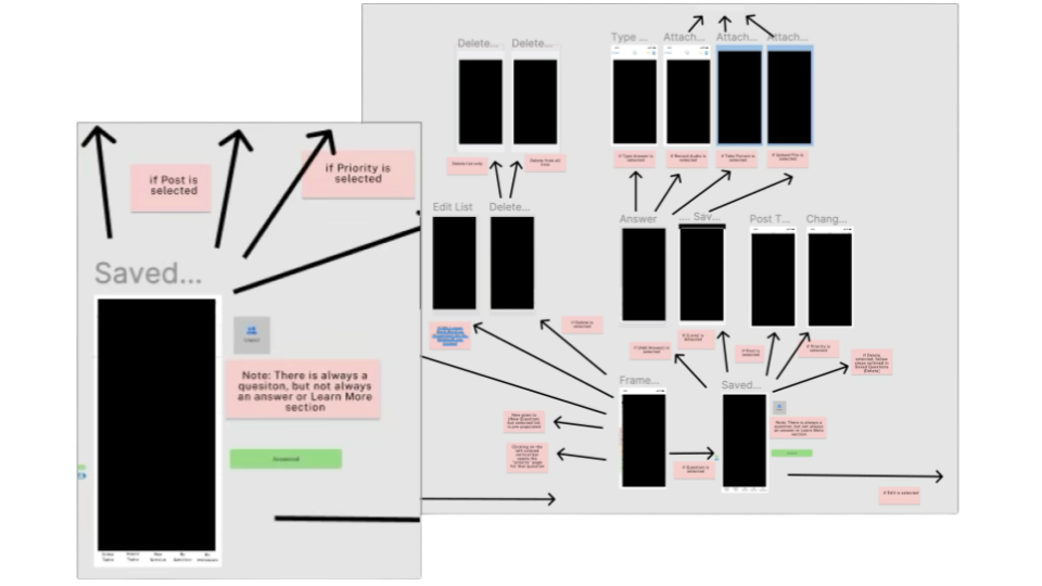
Synchronous meetings were limited to once a week.
The Solution
Asynchronous Figma communication.
The Pink Notes
Real-time questions from the engineer about flow, edge cases, and specs.
The Solution:
A Comprehensive
Design System
80+
High-Fidelity Screens
Full
iOS Adaptation
Complete
Component Library
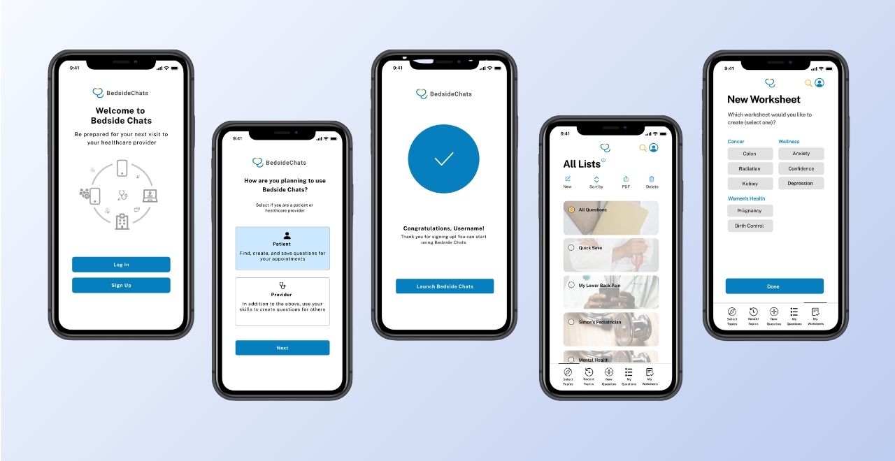
Key Takeaways
Empathy First
Designing for the elderly taught us that accessibility features like clear navigation, simple interactions, and high contrast actually result in a better experience for everyone.
Agile Adaptability
The strategic value of shifting from Waterfall to Scrum to manage time constraints without sacrificing quality.
Clarity Over Trends
Learning that clear navigation and simple interactions outweigh flashy design trends when accessibility is the priority.
“Natalia’s relentless curiosity led her to constantly identify ways to bring value to the team, whether it related to determining how to create highly intuitive customer-focused design elements for a mobile application, which when geared towards 80-year olds with very limited technology experience, is no easy task.”